Pepsi-Flavored Ketchup Is Good, Actually
The new Pepsi Colachup has confounded the internet. But it's sure to taste great.
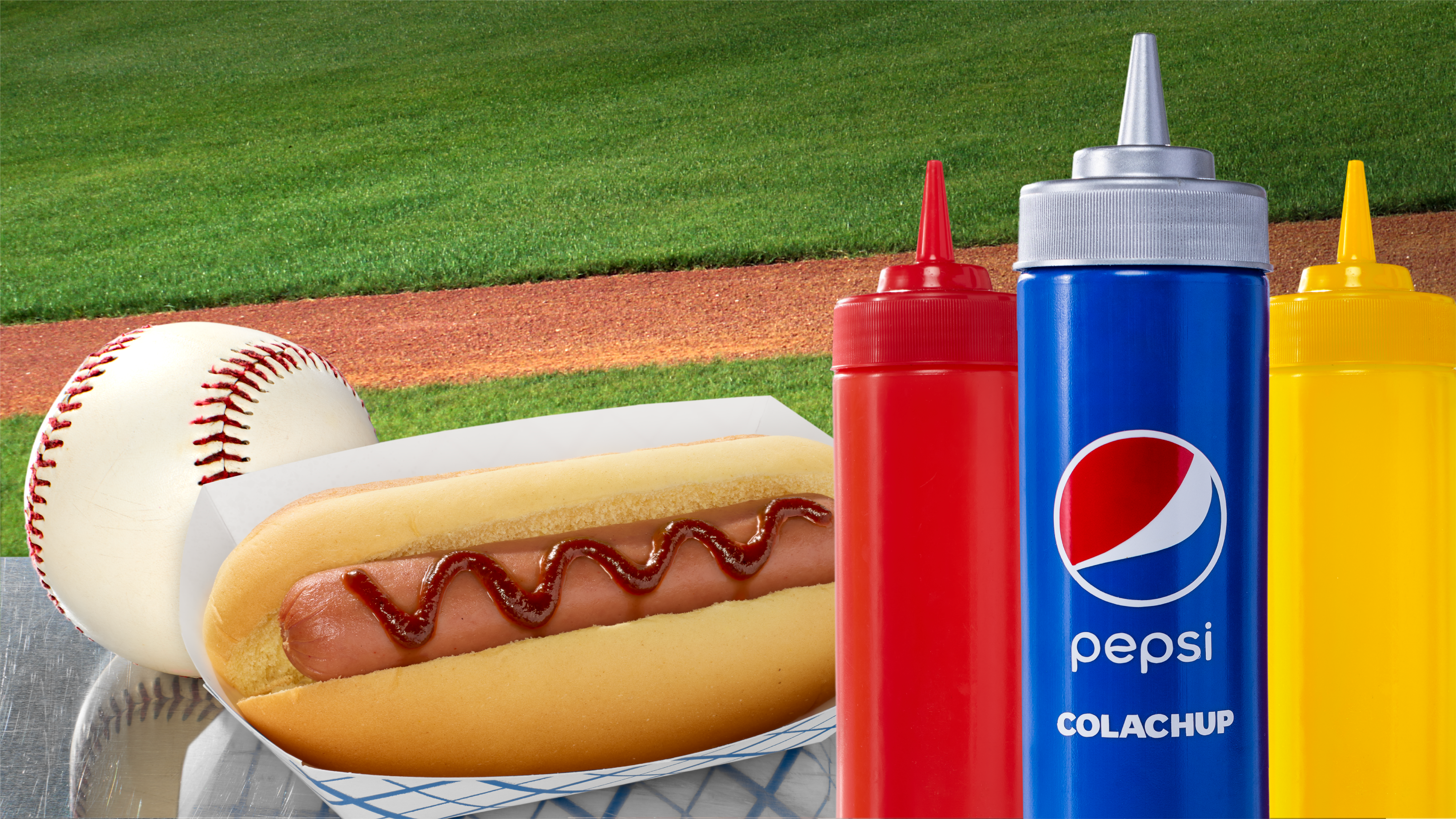
There aren't many things that feel more American than hot dogs, baseball, and soda, right? Pepsi certainly seems to believe this, because in its latest culinary stunt (there have been many), the company has decided to combine these three very patriotic elements into one ultra-limited new condiment: Pepsi Colachup.
It's exactly what it sounds like: This new hot dog topper is made of ketchup that's been infused with Pepsi. It was developed specifically to be served at ballparks, and for one day only, so you could definitely call it an exclusive drop. If you're out enjoying a baseball game on July 4, you'll be able to try Pepsi Colachup in person at the following locations:
- Chase Field, Phoenix, AZ: Section 130/131
- Yankee Stadium, Bronx, NY: Pepsi Lounge (Pepsi Lounge Ticket Required)
- Target Field, Minneapolis, MN: Section 113
- Comerica Park, Detroit, MI: Section 139
Just four MLB ballparks—that's nearly as exclusive as the pickle pizza recently launched at exactly one Pizza Hut location in New York for just one day. While most of America won't get a chance to try Pepsi Colachup, if you're one of the lucky few, we want to hear all about your experience.
Why soda is a great cooking ingredient
The internet is acting horrified by Pepsi Colachup, but they shouldn't be. Sure, by itself, soda's pretty darn sweet, but that's also part of its culinary usefulness. It makes for a novel ingredient in all sorts of dishes, including:
- Pancakes, in which soda serves as a buttermilk replacement and brings a sweet cupcake quality to the finished product
- Orange chicken, where soda can lend an almost teriyaki-esque flavor
- Kimchi, which gets a boost of sweetness and effervescence from the soda
- Sloppy joes, which benefit from the concentrated caramel flavors of a cooked-down cola
Notably, the sloppy joes recipe above pairs equal parts ketchup and cola, and that recipe has been around for decades—so Pepsi Colachup really isn't such an outlandish matchup after all, is it?
Soda and ketchup work together; this is nothing new. Now, coming from Chicago, I'm well aware that the stuff wouldn't be allowed within 100 yards of a hot dog, so it's a good thing it's not being served at our ballparks. But between you and me (I'm whispering right now), I think that I think the stuff will taste just fine on a glizzy.
