Jell-O's First Rebrand In 10 Years Is Exactly What It Needed
The jiggly treat finally has the right vibes to match.
Jell-O, the iconic gelatin brand sold by the Kraft Heinz Company, has just redesigned its logo and packaging, and it's a surprisingly perfect revamp. The product hasn't changed its design in a decade, but the latest update reflects a growing trend among consumer brands, all of which seem to be embracing the idea that what was once old can be made new again.
Take, for example, Pepsi's recent rebrand, a subtle nod to its can designs of the 1970s and 1980s featuring the brand name at the center of the logo in bold black type. Jell-O, much like Pepsi, has a 125-year history, which is a lot to quantify in one product label. But before seeing how the company has chosen to bring that history into 2023, let's take a brief look at how Jell-O first jiggled its way into our hearts.
A brief history of Jell-O
Jell-O, which is made primarily of gelatin, first became the powder-packet dessert we know today back in 1897. Husband-and-wife team Perle and May Waite were the first to combine gelatin powder, sugar, and artificial flavoring into a simple one-packet dessert. They named their creation Jell-O, and two years later they sold the trademark to the Genessee Pure Food Company for $450.
From there, free cookbooks with jiggly salad recipes and other elaborate Jell-O concoctions popularized the dessert in many households. When other midcentury advancements such as the microwave began influencing home cooking, Jell-O lost some favor as a culinary staple, but it did remain popular in Midwestern households thanks in large part to the immigrants who settled there.
Between 1825 and 1925 Scandinavian immigrants came to the Midwest and brought with them an affinity for the jiggly treat. The community relied on church potlucks as a primary social outlet, and so large, cheap, crowd-pleasing one-bowl dishes were the ideal. Jell-O entrees, desserts, and "salads" meet all those requirements.
Jell-O’s logo, past and present
So, how do you modernize a snack so heavily associated with the past?
"In an effort to continue to resonate with younger generations and meet their evolving needs, we've decided to renovate and reinvigorate our iconic brand," Kristina Hannant, associate director of desserts at Kraft Heinz, told The Takeout via email.
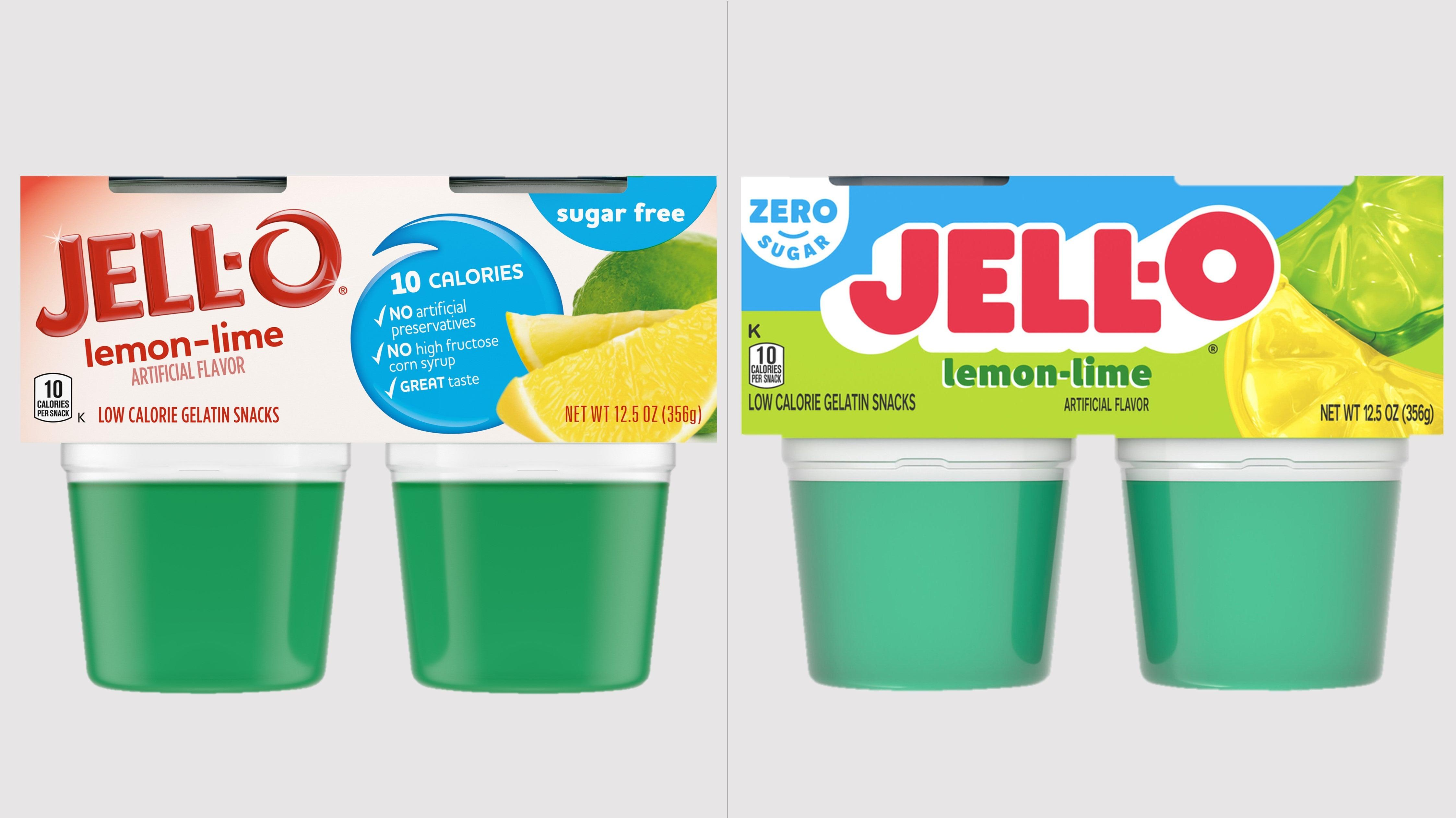
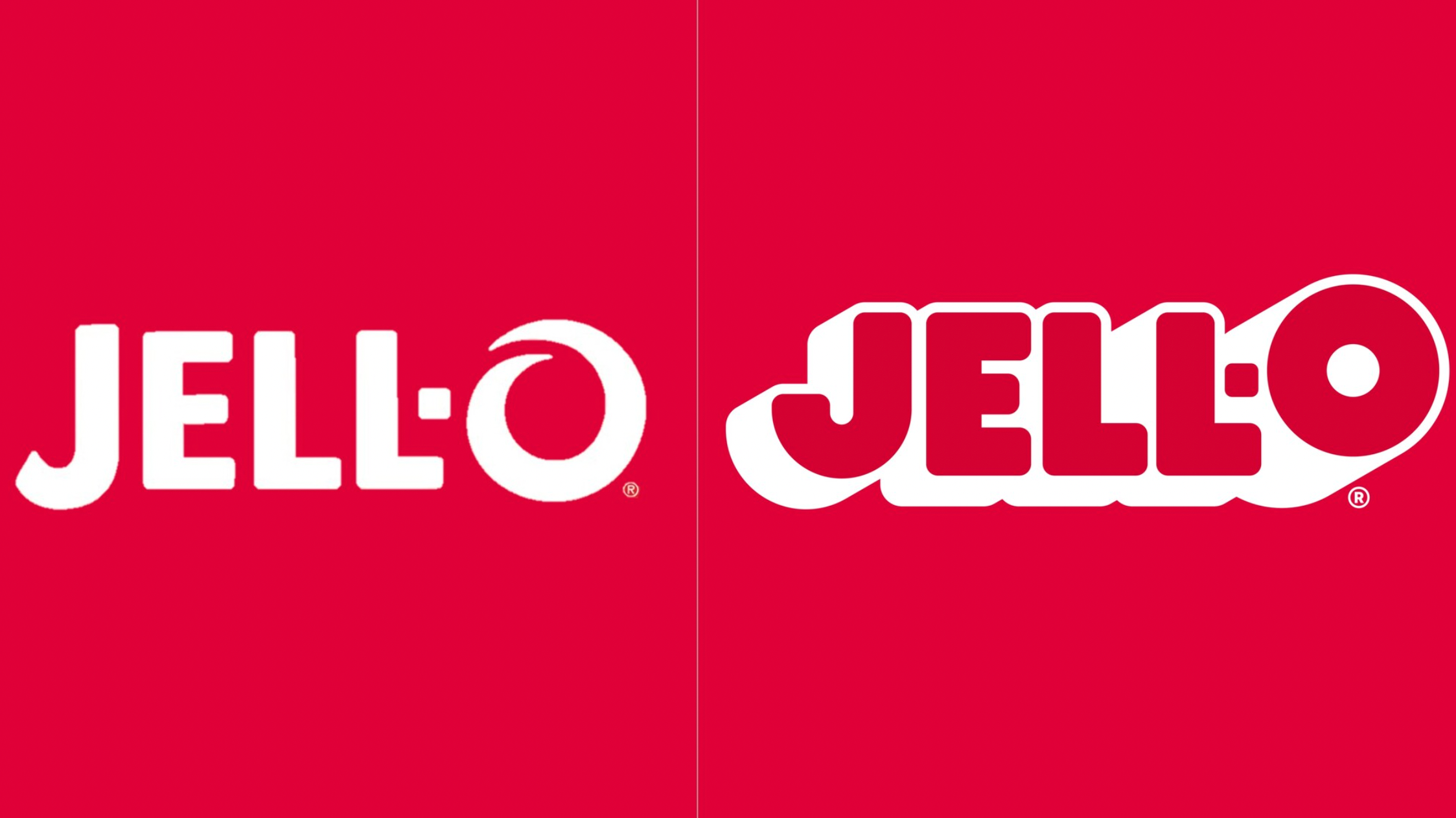
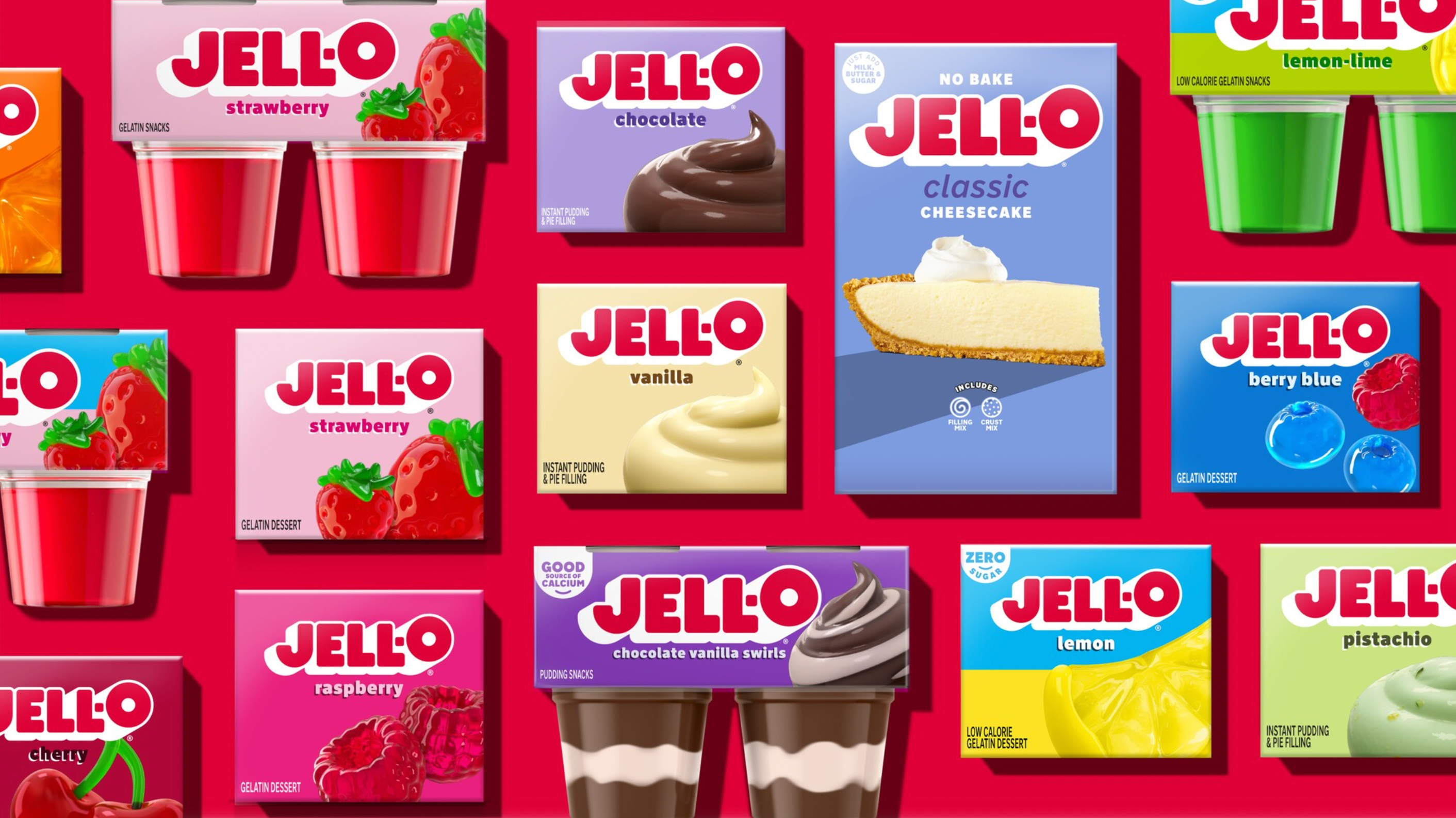
As part of that reinvigoration, the packaging for Jell-O and Jell-O Pudding has gotten a makeover. The lettering of the logo is now "loud, proud and simple, but remains instantly recognizable," per the press release announcing the changes.
The new font emphasizes bubbly, playful letters, offering a retro vibe I imagine Jell-O-salad-making moms of the '70s would have been drawn to. (Back then, the Jell-O logo was rather blocky and boring.) In other words, it's the perfect upgrade. Jell-O is a soft, jiggly dessert, and the old font, with its thin, sharply spiraling "O," just didn't match up. A representative for Jell-O explained that the new logo places added emphasis on the "O" design to position the brand as playful.
The images beside the logo are now different, too, and it's clear the company has put a lot of thought into the changes. The press release details the process: "The new fruit and pudding imagery unleashes imaginations by shifting away from literal depictions of the product to re-imagining how the flavors can come to life in a playful, sensorial way, transporting customers into the Jell-O world of jiggly goodness."
Another subtle change was the decision to replace the phrase "sugar free" with "zero sugar." Though both phrases convey the same message, every design choice is made for a reason.
"We chose this specific language route to modernize our claims to further highlight Jell-O's permissibility and the variety of options available to our consumers," explained Hannant. (We have also noted how the word "zero" has become a trendier, sexier way to convey dietary information in recent years.)
Although the brand describes its new logo as having "a modern aesthetic that stays true to [Jell-O's] playful and colorful roots," the rebranding actually feels more like a throwback, one that is more true to its history than the previous design. While Jell-O's goal is to modernize and attract the younger generation, older fans of the brand will likely appreciate the design just as much.
Asked what Jell-O hopes to see from the rebrand, Hannant said the company will "measure success by tracking sales to show brand love and increased engagement of new, younger consumers." The new design has already begun to rollout nationwide and can be found on both pudding and gelatin products, sold in both cups and boxes.