Huge Changes At Papa John's: It's Now Papa Johns
The brand is presumably trying to stay far away from its founder, John Schnatter.
Papa John's is no longer. A recent press release confirms that the company is rebranding, and one of its changes is tweaking the name from Papa John's to Papa Johns. Whoa. My head just fuckin' exploded. I guess that removal of an apostrophe is supposed to be the chain's way of establishing its new era, but no matter what, I'll always associate the pizza chain with its disgraced founder, John Schnatter. (Who probably didn't eat 40 pizzas in 30 days as he once claimed, but I wish he did.) However, I still maintain that Ruth's Chris has the worst name of any restaurant chain ever.
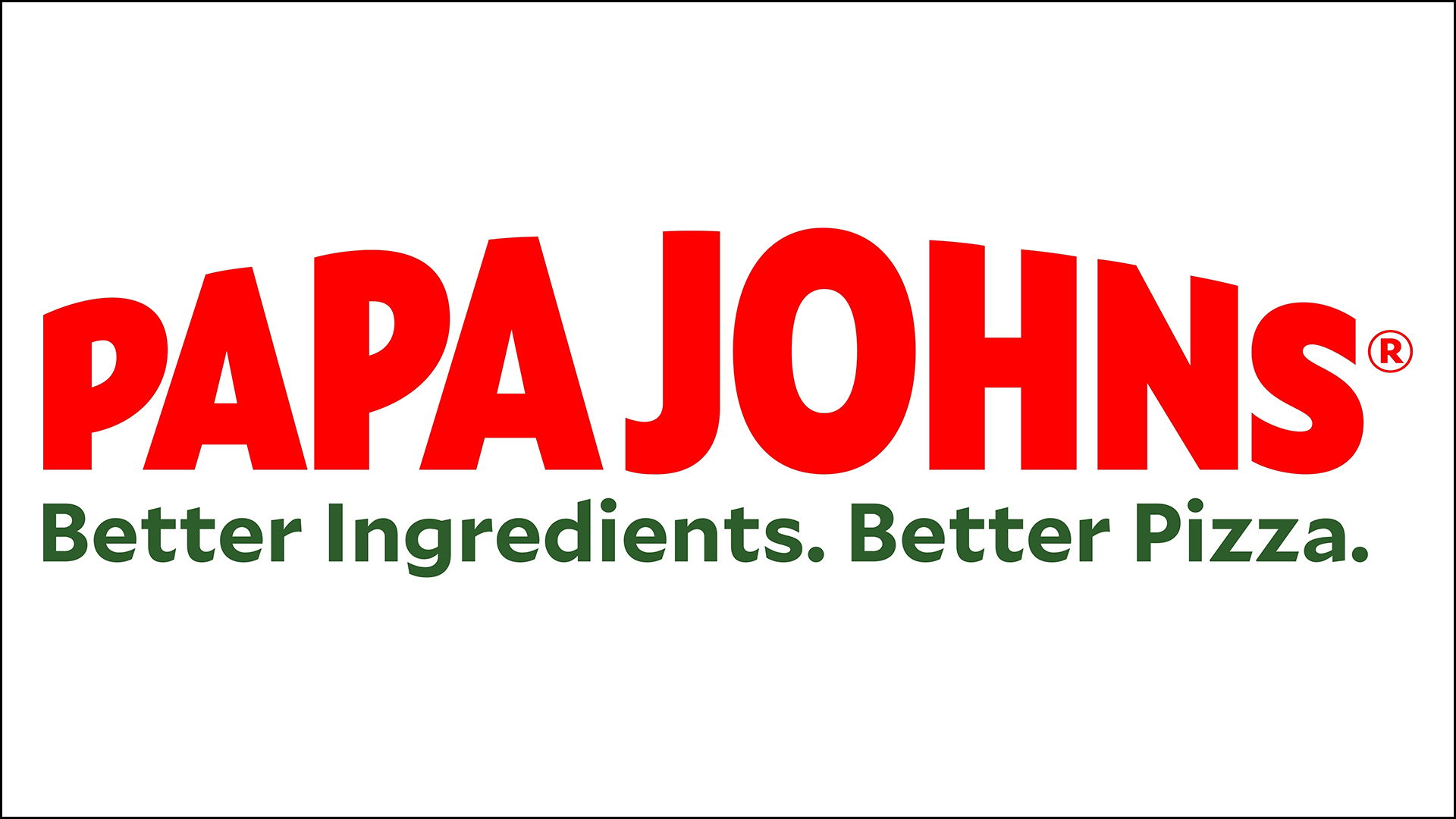
The "Papa Johns" thing is is one of a few rebranding changes the company is undergoing in order to update its look and feel. Another change you might notice is its logo, which has a slightly tweaked color scheme (with brighter colors) and a new font, along with an overall new design. The restaurant will keep its old slogan: "Better ingredients. Better pizza."
I'm thinking a better slogan would be "John doesn't work here anymore," but that's probably just me. Physical design changes will also be implemented, including a self-service pickup counter, though in my mind this will never compete with the Little Caesars "Pizza Portal", where you pick up your order in a locker.
A statement from Papa Johns explains that the overhaul "will modernize the Papa Johns experience and build deeper emotional connections with customers, team members and communities, while preserving what has made the brand so successful – its commitment to high-quality, delicious food created from premium ingredients."
I find it amusing that "emotional connections" are mentioned, because now I'm picturing a little booth where you can confess weird stuff to an employee, who will then reward you with an extra cup of garlic sauce. Which you can use to make shrimp scampi.
This rebrand has been in the works for a long time now, and it won't be implemented all at once. The website already sports the new logo, and I'm guessing you'll be seeing small changes here and there. As for me, I'm going to stare wistfully at the blank space where that apostrophe used to be, then I'll look off into the distance, as if searching for a lost memory. Then I'll take a shot of garlic sauce.