The Bucket-Shaped KFC Restaurant Was A Happy Accident
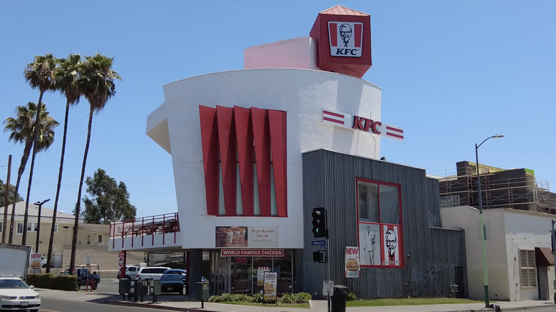
In L.A.'s Koreatown, perched on a sunny corner across the street from a coin laundry, stands a wonder of modern architecture. A large white cylinder of a building, flanked by bright red metal blades, crowned by a cockily-angled red cube adorned with Colonel Sanders' face. That's right, this architectural gem is a Kentucky Fried Chicken franchise.
The eye-catching Koreatown KFC has become something of a fast-food Rorschach test among Los Angeles residents since its construction was completed in 1990. Is it a fried chicken bucket? Is it an actual chicken? Honestly, I can see both interpretations, but bucket seems to be the consensus. Yet the design was never meant to evoke a fast food container or fowl. It was simply intended to be a structurally dynamic, constructivist building — any resemblance to a bucket and/or chicken "wasn't a self-conscious thing," Jeffrey Daniels, one of the building's architects, told Los Angeles Magazine in 2018.
The history of the bucket-shaped KFC
Architecturally-inclined KFC franchisee Jack Wilke commissioned the firm Grinstein/Daniels Inc. to design a two-story KFC in LA's Koreatown in 1989, and construction was completed in 1990. The design draws from constructivist architecture, blending interesting shapes and modern materials to create a sense of opposition and scale. It was also inspired by Googie-style architecture, which uses dramatic geometric shapes and eye-catching materials to draw attention to businesses.
The Koreatown KFC is certainly eye-catching when viewed from the street, but the funky space-age design doesn't stop at the doors. The interior reveals a statement stairwell, 16-foot tall windows, massive skylights, and a (no longer functioning) dumbwaiter. The dining room encompasses the entire second floor, and patrons can even take their KFC saucy nuggets outside and dine on the patio. There's no denying that its unique design makes for good advertising — there are two other KFCs in Koreatown, but the bucket-shaped building is undoubtedly the most well-known. And of course, it's been featured in countless articles (such as this one).
An enduring legacy
Koreatown's bucket-shaped KFC is more than a little divisive — it has been called one of the ugliest buildings in LA by some critics. But other architecture buffs revere it as an eye-catching postmodern masterpiece, a refreshing break from the boxy boringness of most fast-food architecture. Even non-architects can appreciate that it's just plain fun. "People get a kick out of it," Jeffrey Daniels told the Christian Science Monitor in 1990, and Wilke added that sales had been excellent, so far. Considering that the building is still a functioning KFC over 30 years later, it's probably fair to call it a success.
Regardless of how you feel about its aesthetic appeal, it's clear that LA's bucket-shaped KFC has some staying power. After being heavily damaged in a 2017 fire, it was fully repaired and has since received a fresh red-and-white paint job which, in my opinion, makes it look even more like a fried chicken bucket, or perhaps a chicken. Some have suggested that the futuristic fast-food building is simply ahead of its time — who knows, perhaps in 10 or 20 years it will be normal to eat Taco Bell beef in a giant bell and dine on quesadillas at a burrito-shaped Chipotle. We can only hope.


