10 Major Food Rebrands You Never Even Noticed
These brands switched up their image when you weren't paying attention.
There comes a time in life when even our most beloved food brands go through some changes. It's only natural, and it doesn't mean they're not your favorite food brand anymore. It just means they're growing up. While some draw our attention instantly by doing a complete 180, others manage to slide right by us without a second look.
These are some food rebrands that to the untrained eye wouldn't mean much, but at The Takeout, they're worthy of their own slideshow.
Snapple
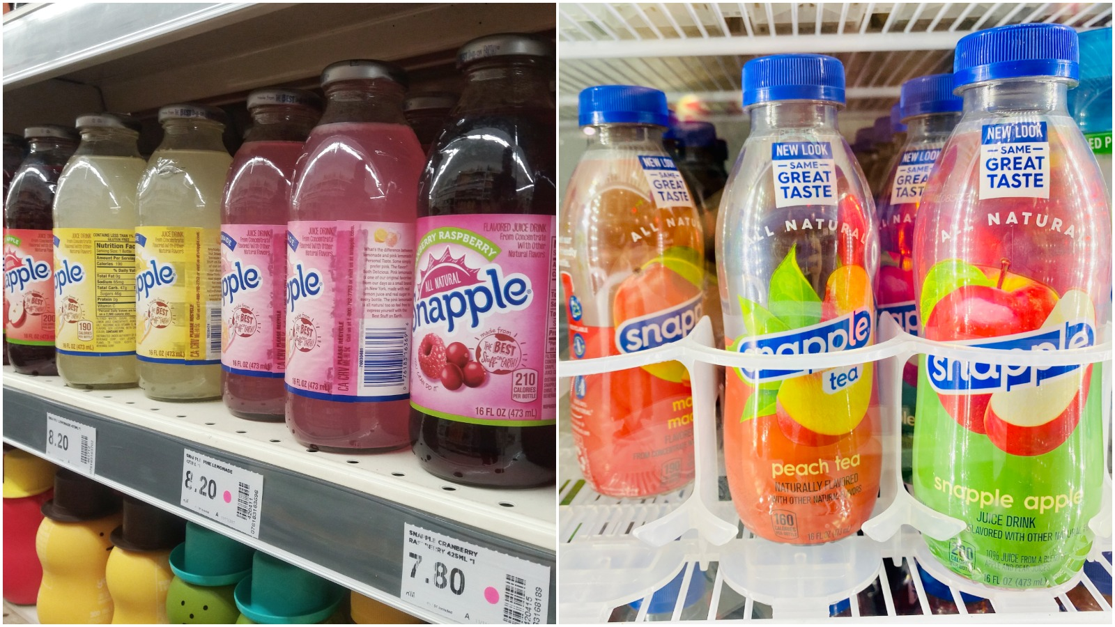
This particular rebrand made me do a double take when I finally noticed. Back in the day (early 2000s), I knew Snapple for its glass bottles, fun facts underneath the cap, and absolutely addictive lemonade flavor. Suddenly it was 2021, the glass bottles were no more and the flavor options were dwindled down. Although the change was drastic, I hadn't picked up a bottle of Snapple in a long while so my first questions was, "Since when was Snapple plastic?"
Guinness
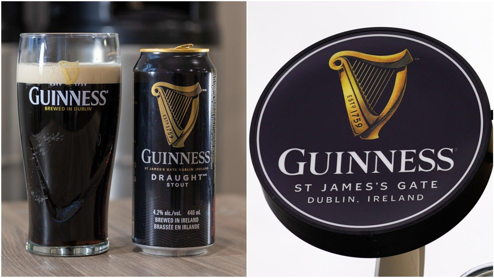
For Guinness beer drinkers, the golden harp has long-been and likely always will be the defining emblem of this brand. However, over the years, this golden harp has undergone some changes. The most recent change happened in 2016, when the harp design was updated from a 2-D image to a more three-dimensional design with gradient and texture.
RxBar
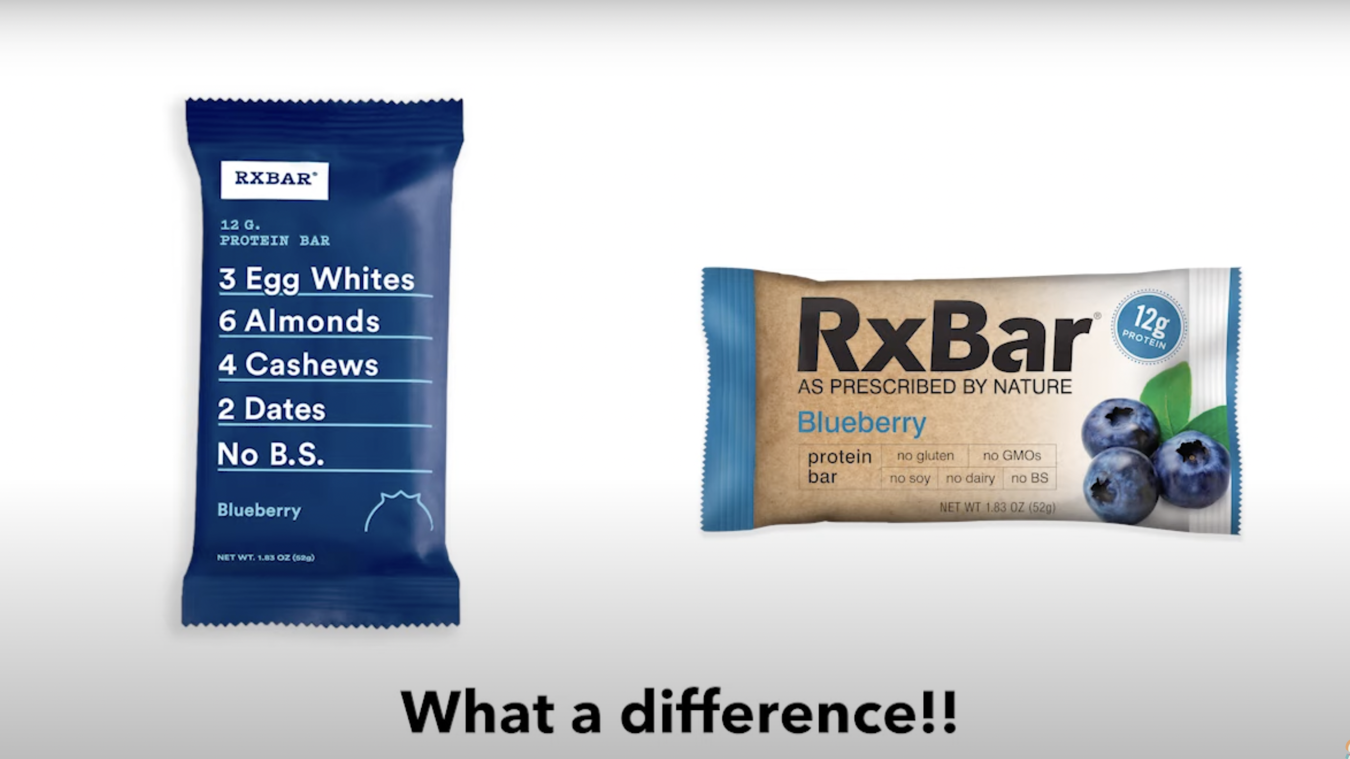
This is the kind of packaging update where the rebrand was so good, we had no idea there ever was an old version. RxBar is a protein/snack bar company recognized most heavily for its straightforward, minimalistic packaging that lists the simple ingredients in the bar right on the front. The design of the bars' packaging is so identifiable that it's unlikely anyone (other than the brand owners themselves) knew that the bars looked different from 2013 to 2016.
Halo Top
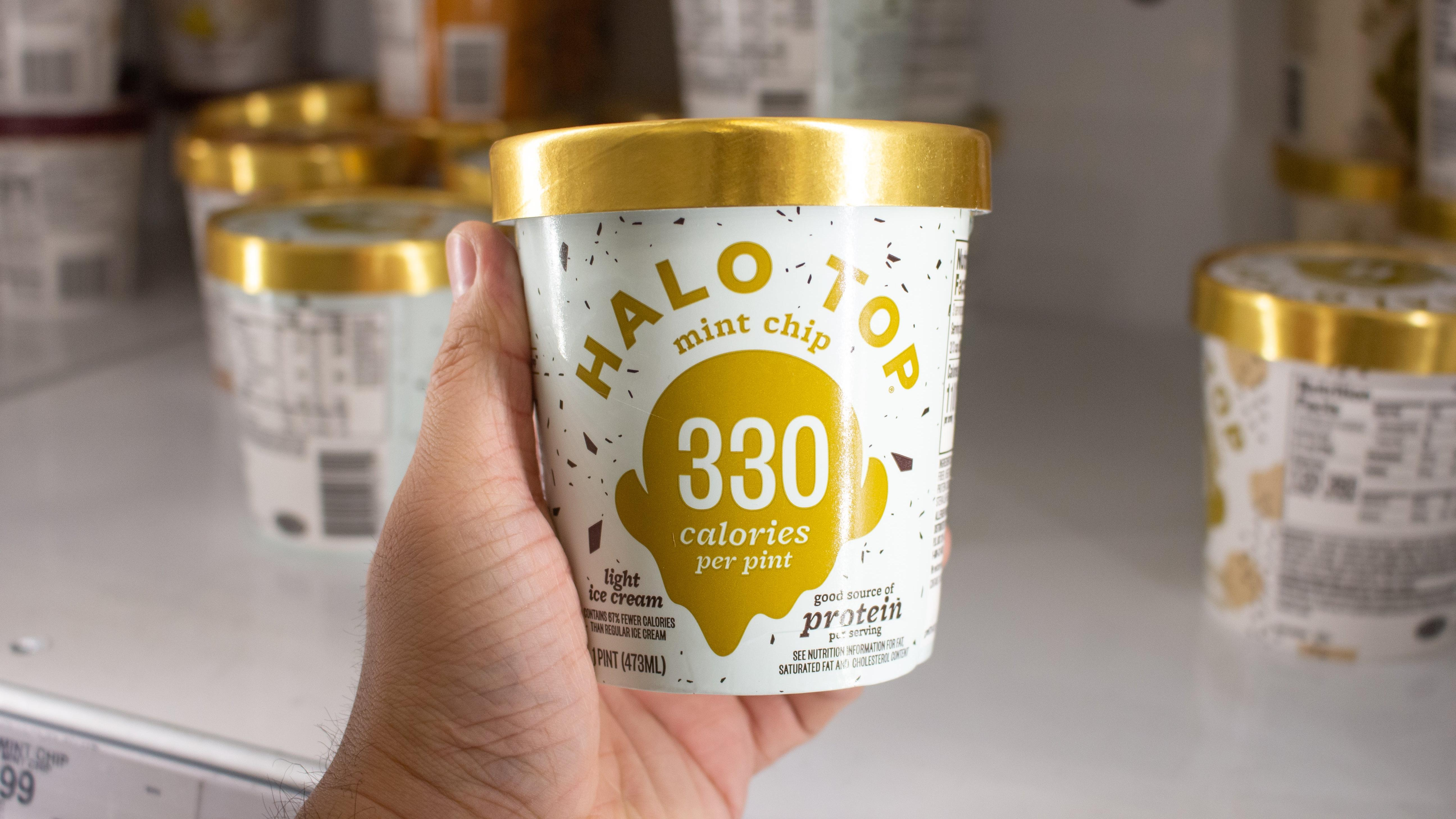
I don't know what exactly was happening from 2015 to 2016, but something must have been going on in the branding world. Around this time is also when the low-calorie ice cream company Halo Top decided to change its image. This is another case where many of us most likely know the brand by its new look and not so much the old one. Before undergoing this makeover, Halo Top's pints of ice cream put more focus on the brand's name instead of showcasing the low-calorie count that now draws many people in.
Chobani
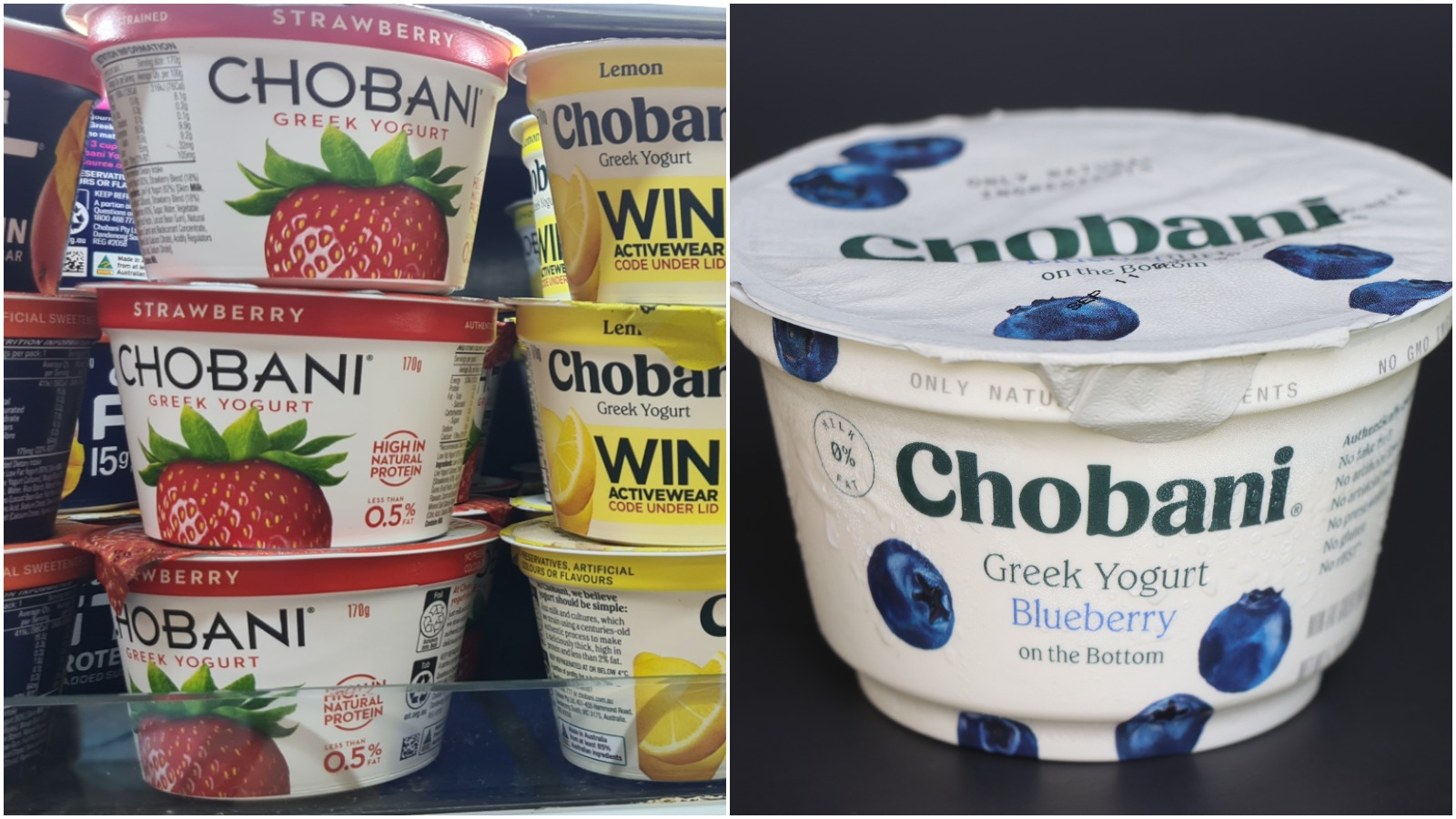
I have no eye for design, so maybe Chobani's packaging update was a bigger transformation than I thought. But to be honest, it's still just Greek yogurt to me. To standout from its competitors, the brand decided to give its packaging a matte finish (rather than glossy like the others) and deemphasize the fruit pieces on the front in favor of a less busy style.
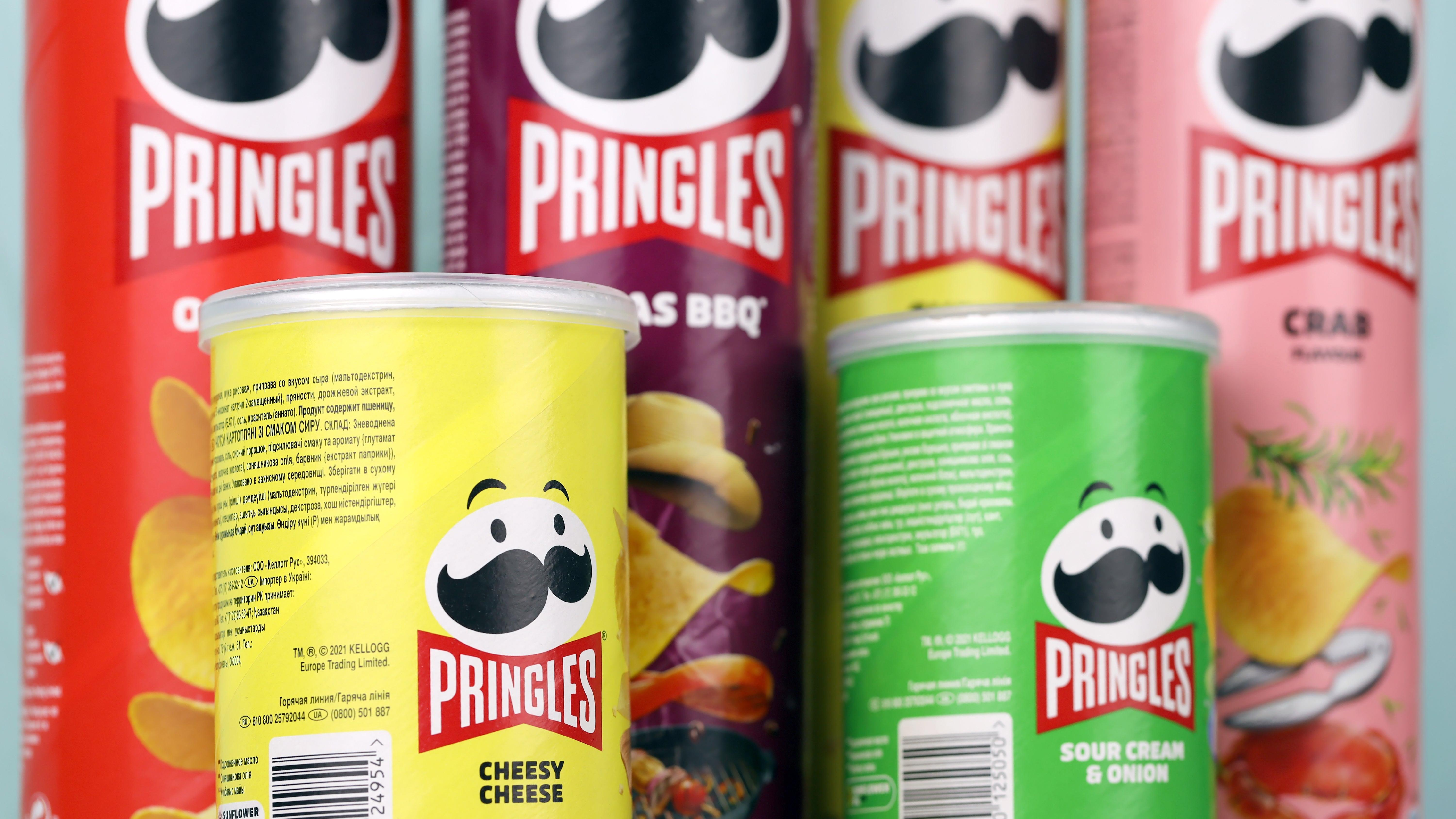
Pringles
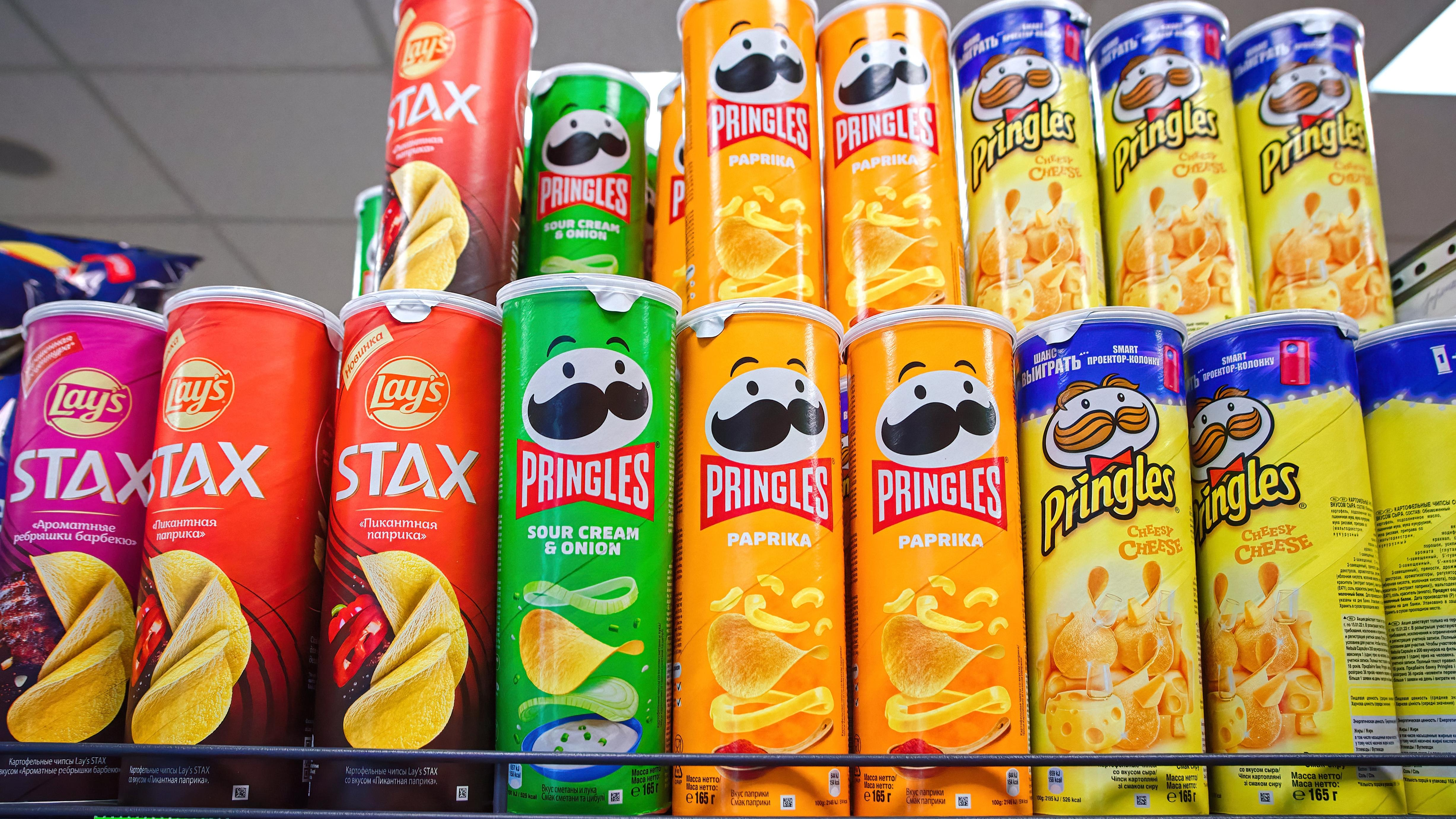
More so an evolution than a full rebrand, Pringles logo man has undergone some cosmetic changes over the years. In 2020, Julius Pringle (yes, he has a name), immediately went bald and lost the little sparkle in his eye that made us trust there were good things in that can of chips. On the bright side, though it's gone from a mahogany to a deep black, his rich 'stache does remain intact.
Tropicana
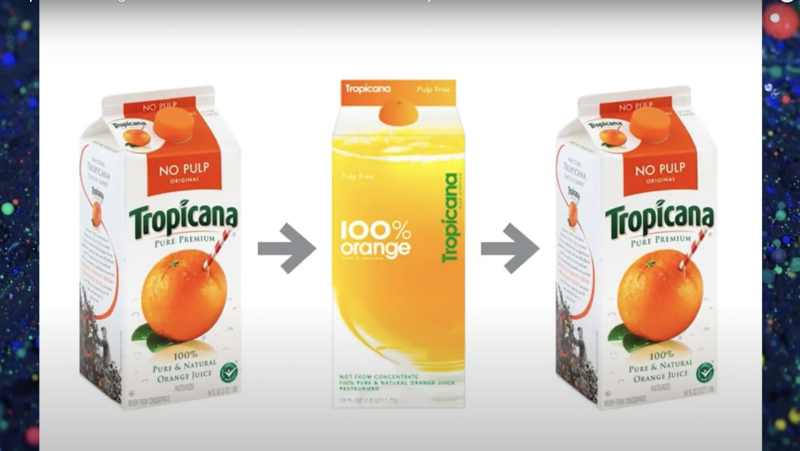
Tropicana's rebrand was such a failure that the reason you may not have noticed it is because the company reversed the change. Much like my middle school fashion choices, some things do deserve a second chance. In 2009, Tropicana changed its packaging from the well-recognized orange with a straw sticking out image to a sparse and somewhat abstract design that zoomed in on a glass of juice. Sales did not go well, and the company ended up going back to its old design within just a few months.
Velveeta
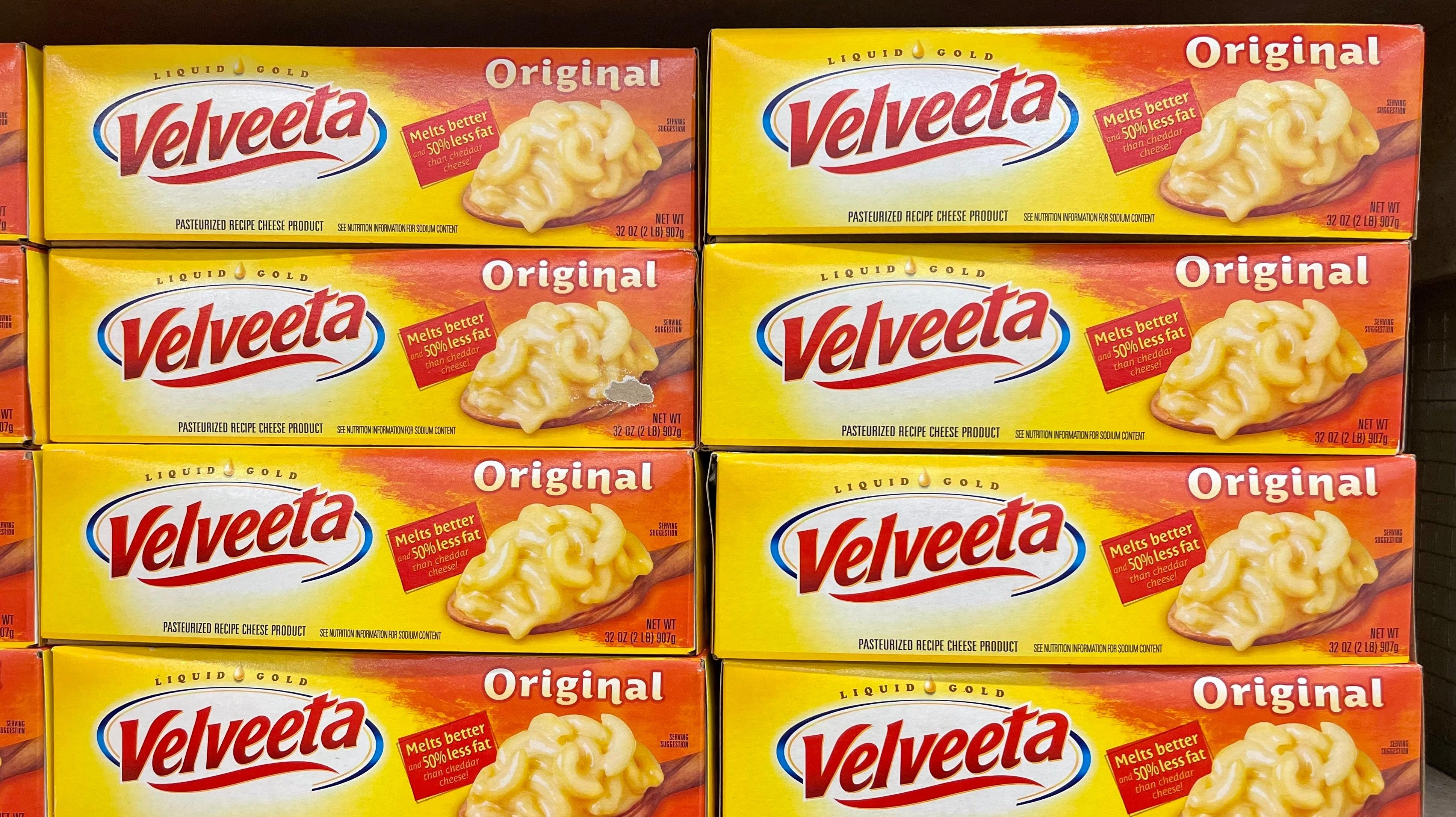
Velveeta's new look is so recent that many of us probably haven't yet realized it happened. The subtle changes to the logo include a removal of the phrase "liquid gold" and removing pretty much everything but the word "Velveeta." The font is also changing, but otherwise, it's still just Velveeta, and you still get a cheesy, delicious dinner from the box.
Sonic
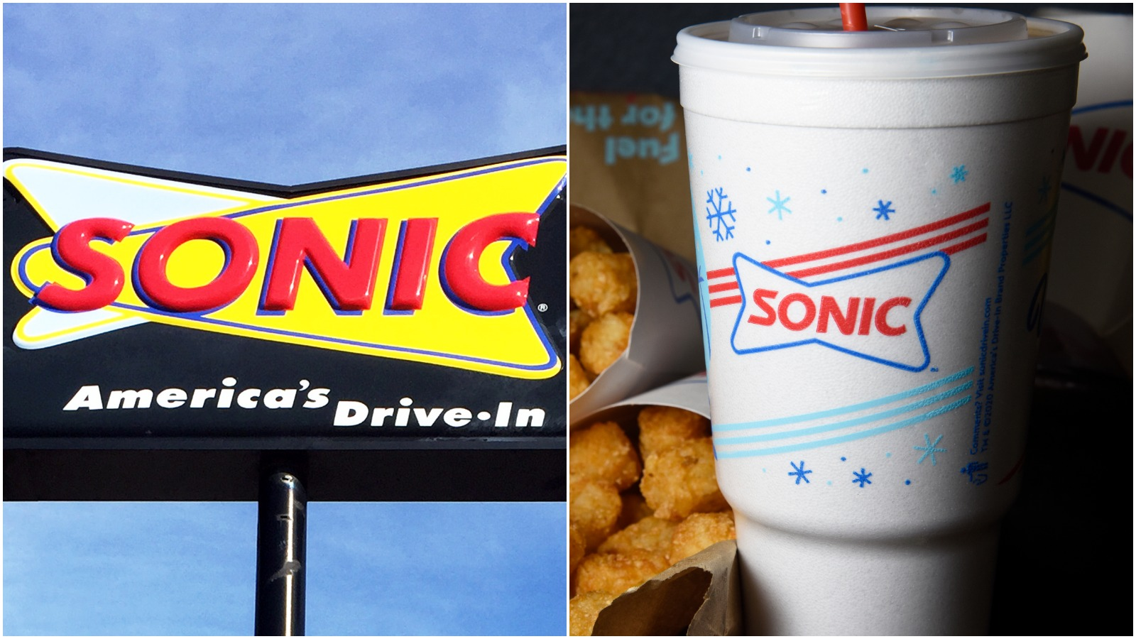
The retro vibes of Sonic's drive-up design are pretty key to its brand identity, so it's understandable why a redesign of the logo would need to still have some qualities of its old logo present. The new logo looks only slightly different from the original design in that its less similar to a cartoon atom and more like a neon sign you'd find outside a dinner in the '50s. Other than that, I wouldn't do a double-take passing by the new sonic sign.
Popeyes
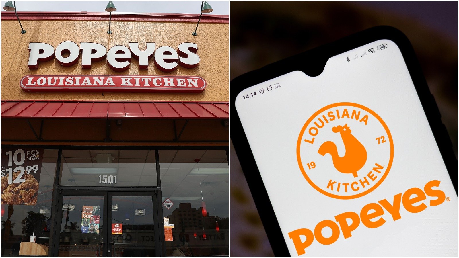
With great success comes great responsibility, and a new look. As the originator of the chicken sandwich wars, Popeyes decided to seize its moment in the spotlight and update its branding. The fast food chicken company adjusted the Popeyes font from bubbly, playful lettering to a clean, more contemporary style. "It is clean and confident and a vast improvement over the goofy bouncing letters of the previous logo," said Debbie Millman, the chair of SVA's Masters in Branding program to Fast Company in 2020.