Last Call: Finding Aesthetic Bliss In The Best Food Labels And Logos
With all the recent talk about easy homemade meals and cheap pantry staples, I'm shocked that Jiffy corn muffin mix doesn't come up in conversation more often. It's usually between 50 and 75 cents per box, requires only a bit of milk and an egg, and reliably produces perfectly golden, sweet and puffy breads, muffins, or cakes. And that box! The most darling little package you ever did see! Its vintage design hails from an era that was all about extraneous quotation marks; the box technically says "JIFFY," in quotes, as if to imply it's being spoken by a proud housewife describing the haste with which she's about to feed her family a delicious meal. I love that the Jiffy box is a little time capsule on the grocery shelf. Much like the product within, it's timeless and reliable.
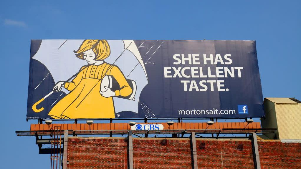
The Morton Salt girl inspires similar feelings of nostalgia and adoration, as millions of forearm tattoos can attest. (Also, I just found out they have an online store with some pretty cute logo merch. Maybe you didn't need to get all that ink after all.) The King Arthur Flour logo doesn't do much for me aesthetically, but I'm sure diehards will point out that it uses a font that is largely unseen across the rest of the grocery store landscape, which I can appreciate.
Are there any foods out there that you continue to buy, or brand loyalties you maintain, because of the small joy their packaging brings? I know that when I see Clabber Girl baking powder in my pantry, it makes me happy to know that some little connection to 1850 is sitting right here in my kitchen, ready to spring into action and make treats that are almost assuredly more sweet and tasty than whatever the 1850s were slinging. Alone now in our homes, we get to pretend to be aesthetes if we want to. Even if our appraisals are not of gallery walls, but the inside of a snack cabinet.