McDonald's Iconic Golden Arches Were A Freudian Slip
Our nation's love for boobs saved the classic logo.
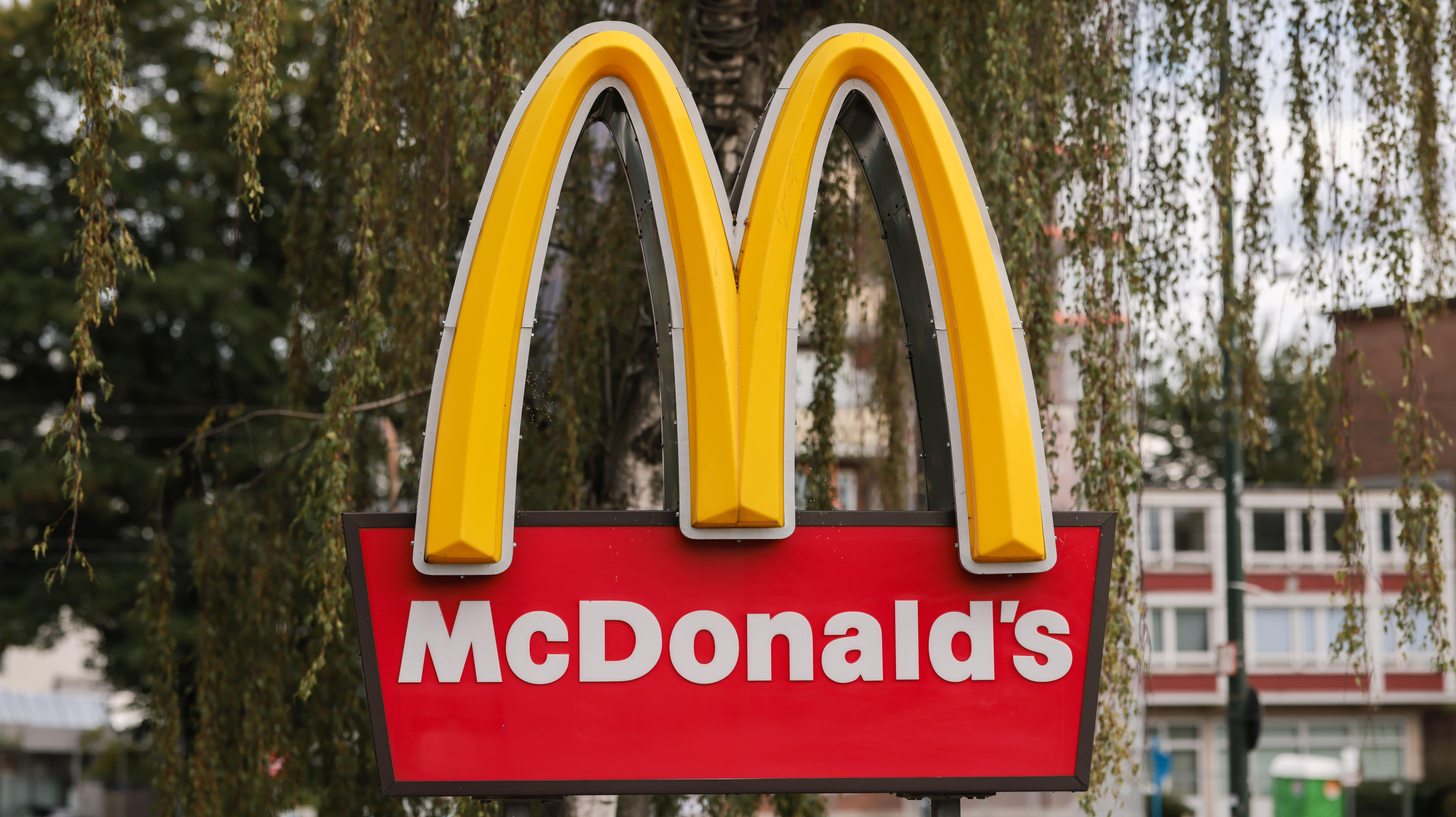
Think of a big, golden "M" and there's not much more I'd have to describe to get you to understand what I'm talking about. What would probably surprise you though (as it surprised me) is that that iconic symbol was almost done away with. The reason it was saved? People love boobs.
McDonald's thought about getting rid of its golden emblem back in the 1960s. Perhaps this part of the story isn't that shocking, as many fast food chains have gone through some rebranding over the years. Take for example, Burger King which went the retro route with its logo design in early 2021. Though not a fast food brand, M&Ms characters have also undergone many changes to get with the times. Not to mention, McDonald's has lots some of its pizzazz over the years.
The more surprising part of this old tale is why McDonald's ended up keeping its well-recognized M. When the company considered its rebrand, it consulted with a psychologist named Louis Cheskin. Pulling from Freudian psychology, Cheskin advised McDonald's to keep the big M design as it "symbolized a mother's nourishing breasts," reported BBC. Ah yes, come rest your weary head under mother McDonald's bosom. Let her ample M draw you into the comfort of a McChicken and fries.
Some have misunderstood the story and said that the McDonald's logo was originally designed to look like breasts, but Snopes has clarified this as untrue. Nostalgia and subliminal messaging isn't a new trick when it comes to marketing, so I think it's safe to say that as weird as the association is, it was a smart move on McDonald's part.
I know that my subconscious mind cannot unsee what I have learned.
You're welcome for possibly changing your next McDonald's Mc-xperience.