IHOP's New "IHOb" Logo Looks Like A Tampon Brand
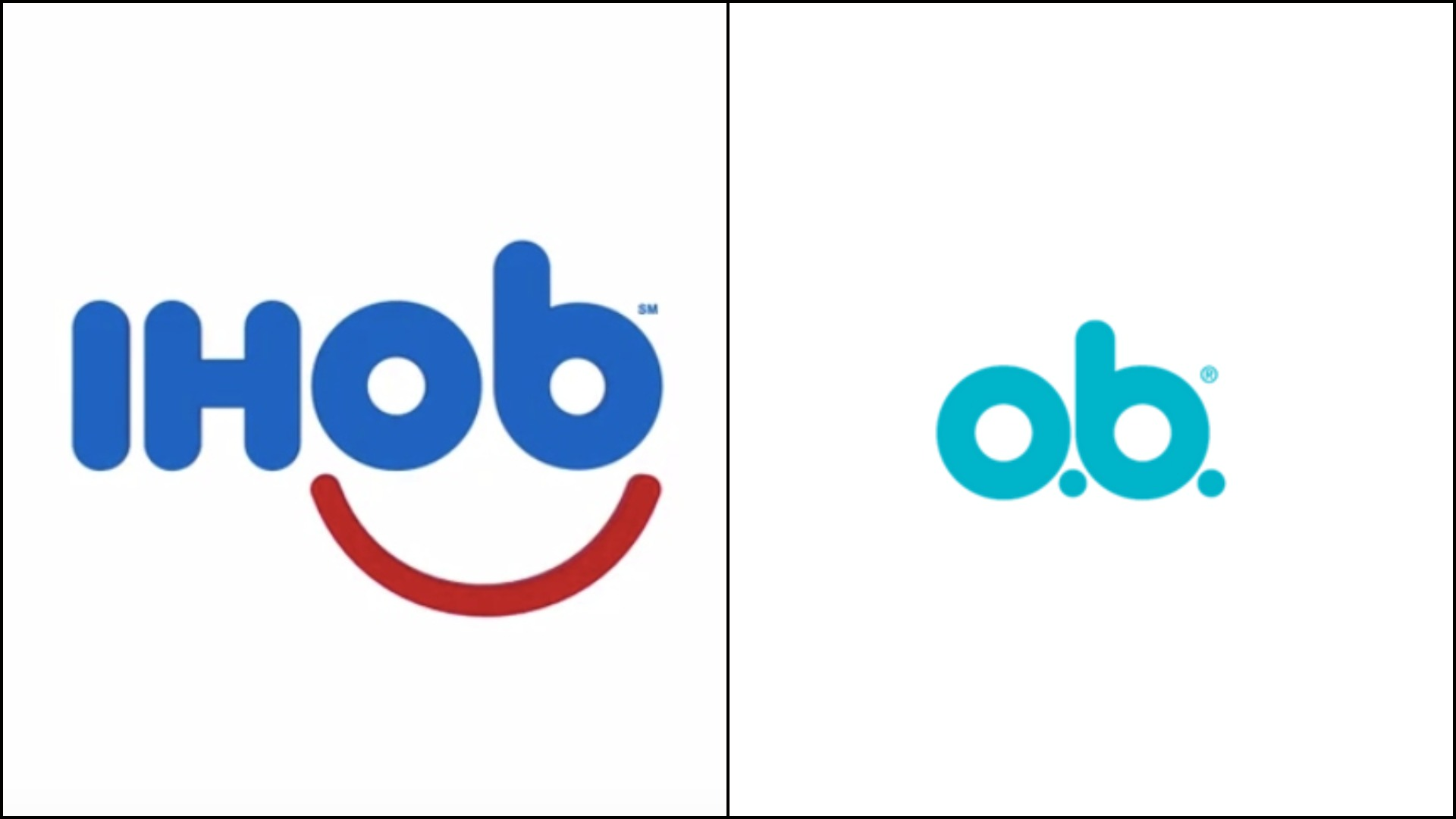
Earlier this week, breakfast chain IHOP announced via Twitter that it would soon be (inexplicably) changing its name to IHOb; the reason behind the earth-shaking move will be announced on June 11. Our bet is on the "b" standing for "breakfast," which will be a really anticlimactic reveal if that's the case. But the women on The Takeout staff couldn't help but notice the last two letters of the new IHOb logo bear an uncanny resemblance to another brand unrelated to pancakes or hot coffee: o.b. tampons.
See? I'm no typographer, but tell me that's not a dead ringer. Is this just another case of a marketing team lacking people who menstruate to point out such an obvious association? For those skeptics out there who think it's ridiculous for us to notice the tampon-related resemblance in the logo, let me point out that o.b. is not just any tampon brand. It is a tampon brand with a cult following: When o.b. packages temporarily disappeared from shelves a few years ago, its fans were devastated. (By the way, gentlemen of The Takeout commentariat, it is perfectly acceptable not to opine on this story.)
Anyhow, tampon resemblance or not, the logo change is just a marketing ploy by IHOP, hoping to get media to write about its restaurants in a fun, quirky light to divert from this sad incident that happened at an Arkansas location a few weeks ago. And if this IHOb thing turns out to be just a stunt without any lasting change to the pancake house's logos or signs, we're going to start referring to it as the International House Of Bullshit.