The New Gushers Logo Actually Looks Great
Fruit by the Foot and Gushers each unveiled a fresh new logo and package redesign.
Two brands integral to my childhood are sporting makeovers today, and it's making me feel a little old. According to a press release sent to The Takeout, General Mills has redesigned the logo of both Fruit by the Foot and Gushers, and their packaging has gotten an overall update, lending the products a more modern look. While some folks might prefer the old aesthetic, at least these lunchbox staples are still alive and kicking rather than heading to the brand graveyard. It's probably about time they got some fresh fades, anyway.
The announcement was initially teased in two videos made by Emily Zugay, a TikTok user with over 4 million followers. In partnership with General Mills, Zugay took the liberty of creating her own logo redesigns, one for Fruit By The Foot and one for Gushers, both of which looked like they were slapped together in Microsoft Paint. Though the videos were funny, the actual new brand logos have now been revealed, and they are definitely much better than Zugay's attempts.
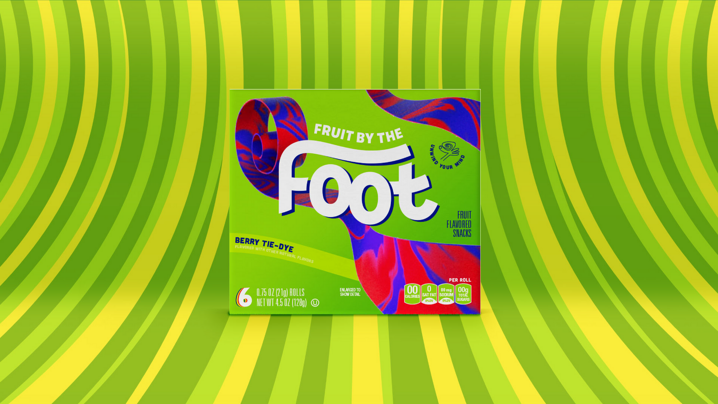
Fruit by the Foot’s new logo
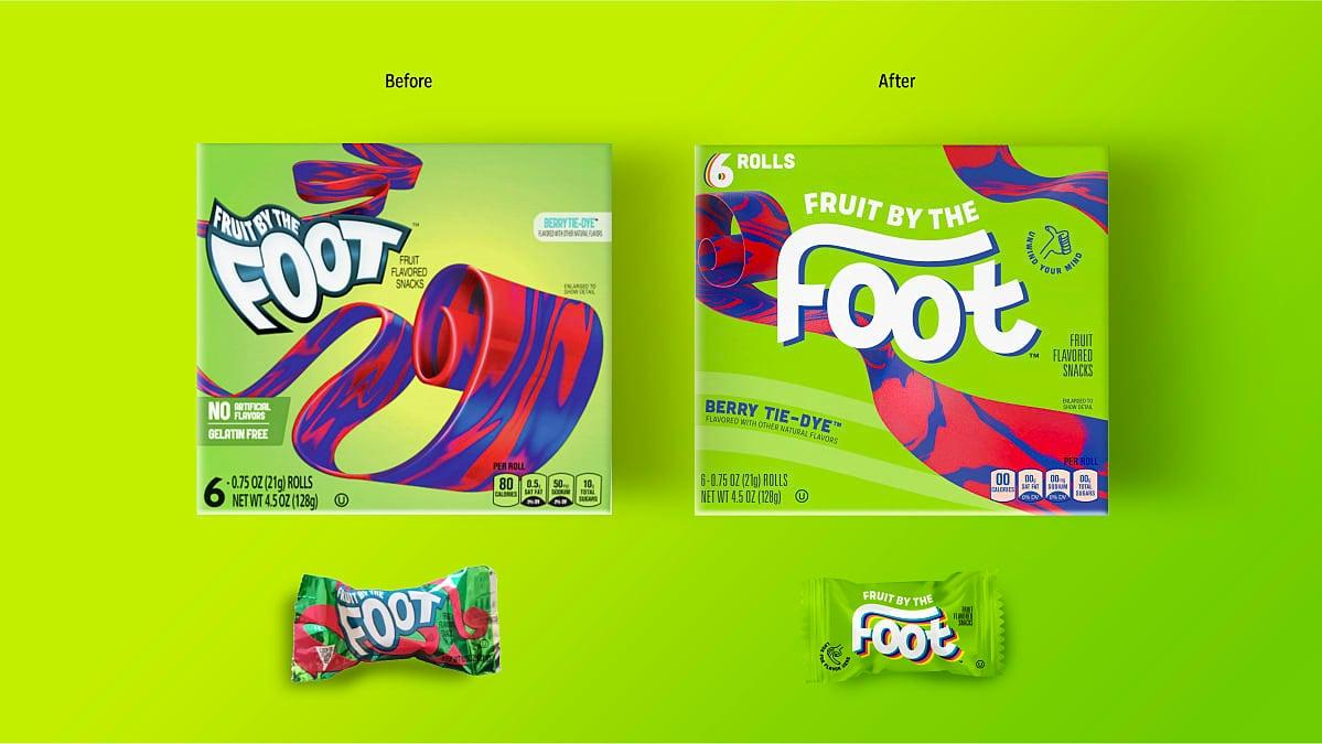
It's been a while since I've eaten Fruit by the Foot, but everyone's favorite sweet snack strip is now sporting a more minimalist look. The font is less angular, and the "f" is stretched out across the whole logo, a nod to the product inside. As seen above, it's in rather stark contrast to the former version, which has sharp edges, trippy waves, and a cartoonish vibe. All in all, the new packaging better reflects what's inside and has a sleeker look and feel, and the wrapper on each individual snack is slightly less chaotic. Thank goodness the updated box kept all the loud neon colors of my youth.
Gushers’ new logo
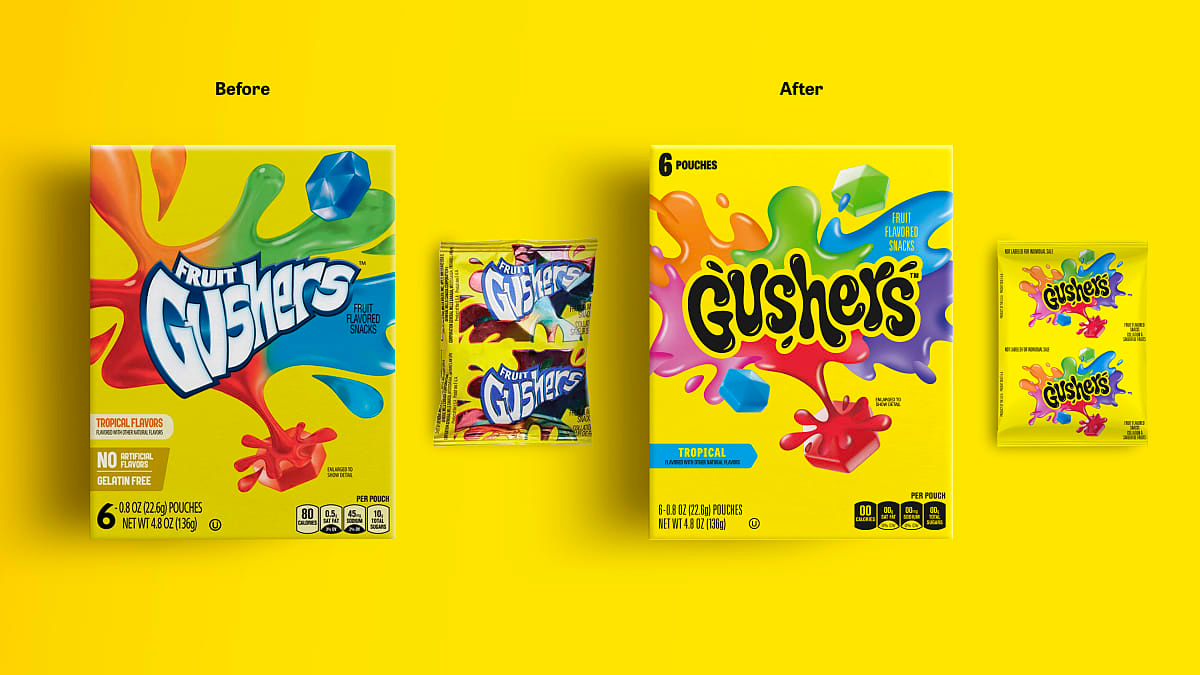
Gushers, the fruit snack with a liquid center, now has a logo that looks, for a lack of a better word, wetter. The word "Gushers," no longer accompanied by the word "fruit," is instead joined by accenting squirt marks squelching out of the puffy font, and the rainbow puddles in the background are reminiscent of the frenzied finale of Nintendo's paint-spattered Splatoon. There's a little more implied motion in the new design, and wow, I sound like an art curator all of a sudden.
The previous logo is decidedly simpler, with the same sort of angular font as Fruit by the Foot, and the old box has fewer colors splashing outward from the product name. The old font gives the packaging a vintage vibe; in case you're curious, here's a fun illustration of the evolution of the Gushers logo. In retrospect, it did look a little out of date, and the new logo is definitely the biggest departure the brand has ever taken from previous iterations. It's 2023 now (already?), and a makeover feels overdue.
How do you feel about the new logos? Do they feel like a fresh and fitting tribute to our childhood favorites, or do they fly in the face of everything that makes these snacks great?