New KFC Ads Are Metaphoric, Artistic Masterpieces
I do not have an M.F.A. in any type of visual art. I have never been employed by a museum or gallery. I once thought it was in good taste to display a black-light velvet poster featuring the band Sublime on my wall. But hear me out: KFC's new ads are definitely art.
Clever @KFC ads perfectly replaced fire with spicy fried chicken: https://t.co/PlxHNo18N9 pic.twitter.com/z94zHftWoj
— ADWEEK (@Adweek) April 18, 2018
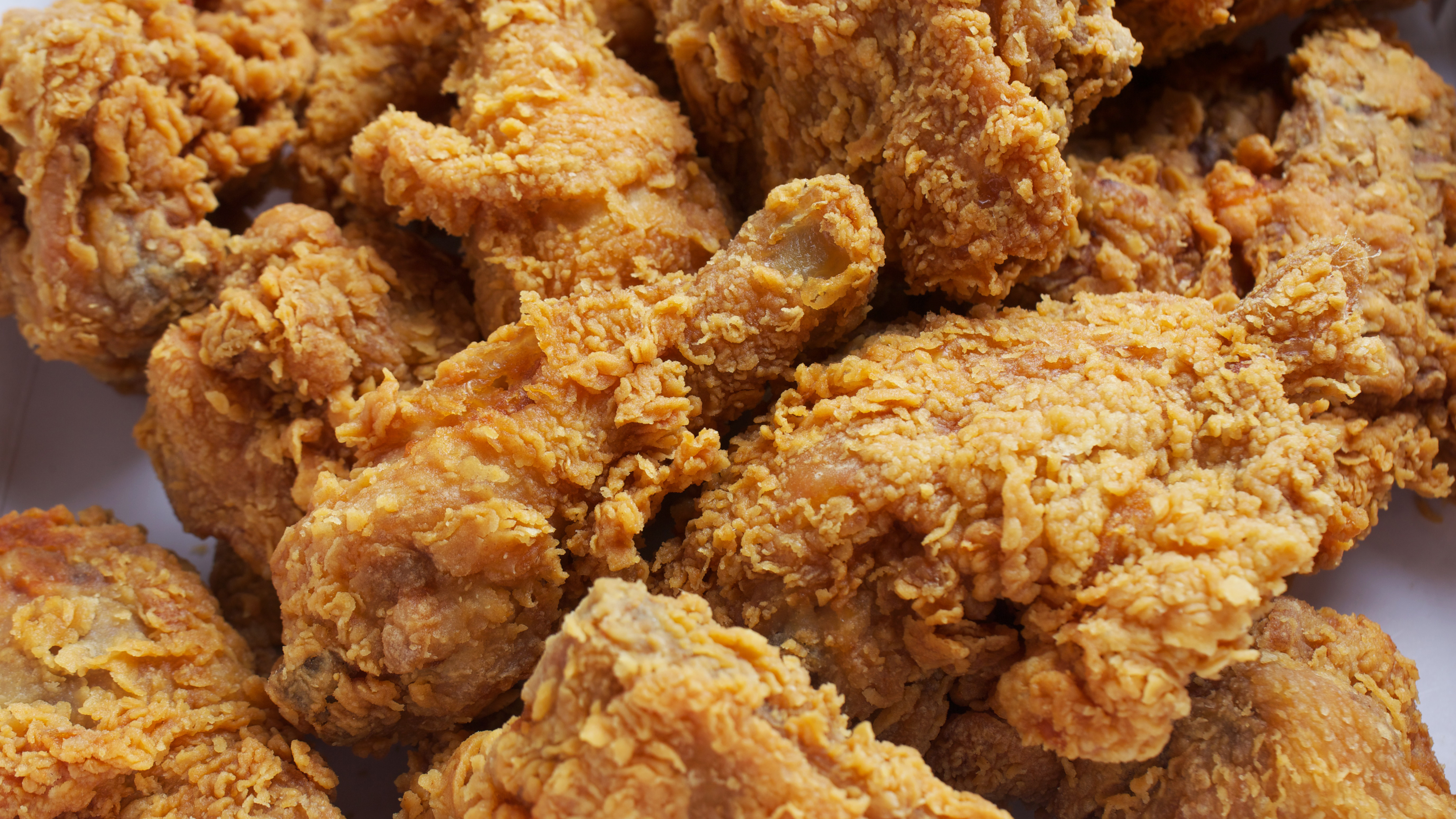
The print ads, developed by the Hong Kong branch of the advertising agency Ogilvy, insert gorgeously textured spicy fried chicken into photographs in place of fire. (Why didn't you think of that, Picasso?) Instead of flames, crispy-golden fried chicken emits from a rocket ship, or the back of a race car, or behind Power Rangers (seriously). AdWeek calls it a "simple and effective metaphor." And that is what art is about, I think. That and sleeping babies dressed up as flowers.
AdWeek continues to heap on the praise like so many scoops of mashed potatoes: "Once you get the concept, you get the concept and can just sit back and appreciate the craft." If KFC offered prints of these, we might just have to purchase one to adorn The Takeout headquarters. It can go next to our dogs-playing-poker masterpiece.
